Comparing Two Different Types of Graphics
The following two graphics are from a paper on warehouse storage and product management:
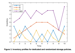
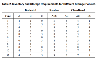
These two graphics both seem to be showing the comparison of two variables. In this case, both are showing how the total inventory in a warehouse may be distributed over time. In the article, both graphics appear in the same place to help show that a dedicated and random (class-based) storage policy is optimal. So, the location of these graphics are good as they help the reader understand why the class-based policy is best. However, the graph on the right seems like the wrong type for this kind of situation. If they are trying to show a change over time, a line graph, such as the one on the left, is more appealing. It does a much better job of grabbing the reader’s attention and portraying the information in a quick and easy to understand manner. Another thing they both do well, for the most part, is providing plenty of information without giving too much detail that crowds the graphs. The titles are very informative, while the names of the variables are kept short and to the point. However, the line and column names might be too brief. It isn’t too clear what A, B, and C mean when just looking at the graphics. In context with the paper, it is made clear that these are classes of storage, but it would be more helpful to the reader if this was also specified in the graphics. In terms of color, the graphic on the left does a great job of using contrasting colors to make it clear which line is which as they cross over one another. Although the table at the right lacks color, the addition of any colors wouldn’t support the reader’s understanding of the graphic. The lack of color there is an effective strategy.
Guidelines for Creating Effective Graphics
Tables. Look table from the previous section. There are a few things this tables does right and wrong. It starts out with a table number and an informative title, but is is lacking units. It is not quite clear that these are inventory numbers, and even if it was, are the units in hundreds of packages or just packages. Although the data in this table should likely be represented as a line graph instead, the rows and columns are ordered in a useful way, sequentially from 1 to 10 and A to C respectively.
Line Graphs. Look at the line graph from the previous section. This graphic seems to do most things right. The one missing thing is the source, but in the context of this paper, this graph has been created for use as an example of what a class-based storage policy might mean. Perhaps a note could have been included to identify the graph as an example. Beyond this, every other aspect of the graph seems perfect for its intention. The row and column headers are clear, although it might be better if they had units. The only reason it may be okay this time is given the fact that this visual was created solely for example. As mentioned before, the color contrast and labeling is all done very well. It also correctly contains a figure number and title. The tick-marks along the edges also follow protocol.
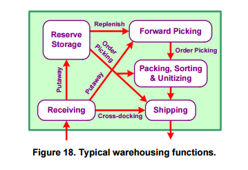 Flowcharts. Take a look at this flowchart on the left. This is a very simple flowchart, but it does many things well. The point of the chart is to show how inventory flows through a warehouse. It has a well-placed title, and it effectively uses arrows to show how packages travel. One thing it is lacking is a variance of symbols to signify what different types of steps there are. Although each step is properly labeled, multiple symbols or possibly even drawings that signify what each step is would make this flow chart more effectively convey the point it is trying to make.
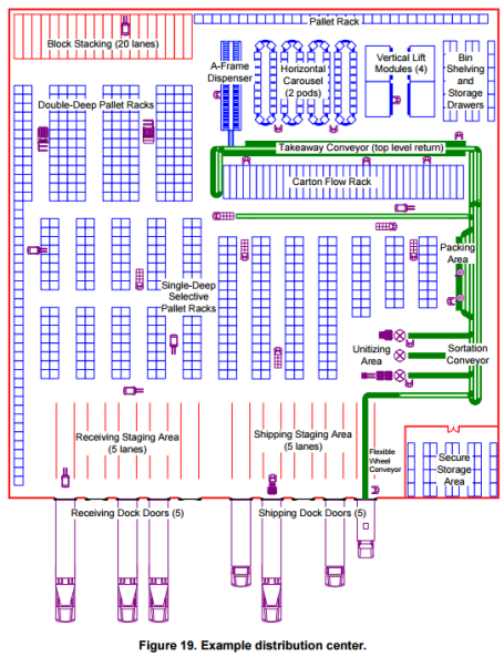
Drawings. The drawing above is being used as example of a warehouse for distributing goods. The point is to show what all exists in a distribution center. There are good and bad things with this drawing. The labeling is all done fairly well and it is clear what the different section are. However, the forklifts in the isles is a bit distracting. They seems to take away from the point of the drawing a little bit. The coloring, on the other hand, is perfect for grabbing the reader’s attention to show them what is important in the picture.
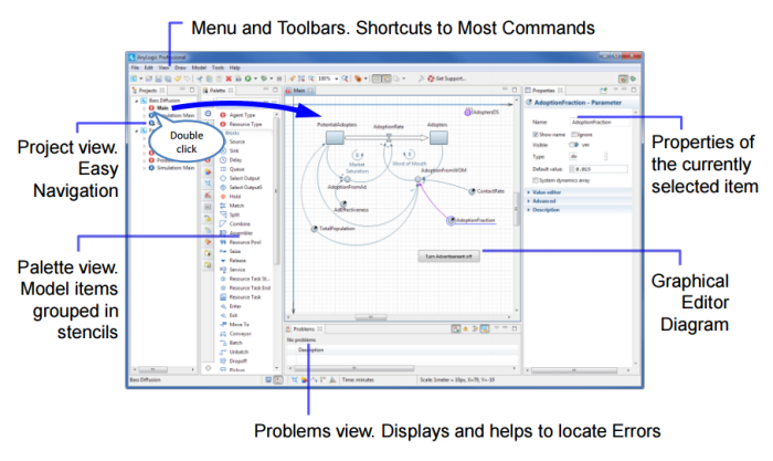
Screenshots. The screenshot above perfectly describes someone of the features in this application. It is cropped perfectly and only shows the window that needs to be viewed. In addition to this, the many parts of the application are labeled very well. It is very clear what everything is on the screen. It even shows a few easy steps to switch to another view. The only downside there could be is that the icons are little small on the screen. Otherwise, this is a great screenshot.
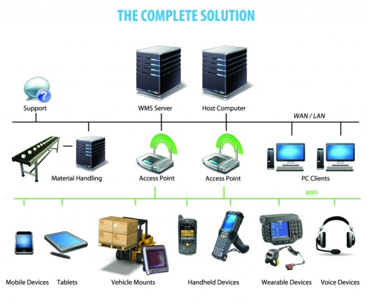
Organizational Charts. The organizational chart above is used to show how different devices are tied together and communicate. It does a great job of helping the reader understand the structure of the system. This chart is not as formal as an organizational chart that is meant to show the structure of a business. This one does a great job of using images to help the reader visualize the system, meanwhile, a business structure would likely be more formal using plain boxes as opposed to pictures.
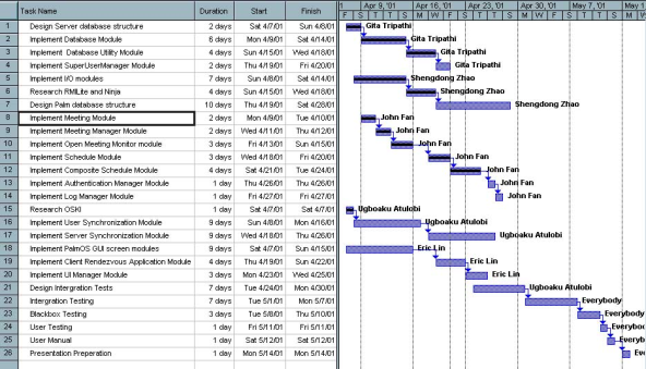
Schedule Charts. The schedule chart above is what is known as a Gantt chart. There are a few good things about this one, but there are also a few issues. It fails to mark major releases with a diamond, and it also doesn’t have clear subtasks for each project phase. Besides these issues, it does a good job of using the bars and arrows to show the order in which the tasks should be completed in a critical path.
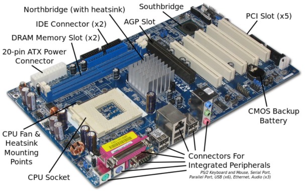
Photographs. The photograph above is used to show what kind of hardware exists within a computer. An image, like the one above, should include labels to point out what each part of the computer is. It is quite clear what the layout of this computer is from the image. The labels are positioned perfectly with indicators that do not cover up any important parts of the image. One downside to this photograph is the fact that the lack of a surrounding could make it difficult to find this piece of hardware if it is located within a larger system.
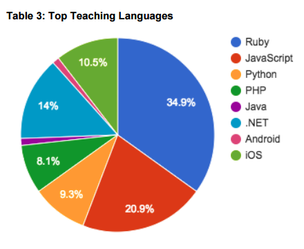 Pie Charts. The pie chart to the right is used to show what the top teaching languages in some online courses are. There are some good and bad things about this image. It should have a figure number, but it is labeled as a table instead. Beyond that, it is quite clear what the pie chart is trying to show. There is no distortion given that it is a two-dimensional image, and the pieces of the pie are clearly labeled with contrasting colors. It also properly begins the largest wedge in the twelve o-clock position.

 and their drivers to assure that the right person is driving each vehicle. In the past, drivers have had to carry key fobs to confirm their identity, but this can be expensive. Many companies are moving toward adding forward and cabin-facing cameras for use on the road. With the proper facial recognition technology, these cameras can be utilized for driver recognition which will cut down on cost.
 camera captures the person’s face and compares it to the proper driver’s face in the database. If there isn’t a match, it will then alert the company that the wrong person may be driving that vehicle. This will be useful in preventing everything from hijackings to drivers accidentally going to the wrong vehicle.
 In order for any workplace to be successful, there must be an effective means of